Over the years I’ve worked with many colors – been seduced by the art of mixing a color, and overwhelmed by the effect colors have on one another and the energy they create. They repeatedly seduce – distract it seems. I’ve always thought that the Impressionists’ work – the impressions of what they first see – is deceptive. Color directly out of the tube is sensational for sure, but first impressions rarely last. And why is it when I am painting with colors I have to sit back for a minute and ask myself if it “looks beautiful/pretty”? I never do this with black and white paints.
With black and white paints I feel I can easily navigate the essentials of something, the content. I’m happy to lose the more pleasing bits of the work in order to get at the core of something. Black and white photography for me has always been about content and less about feeling – the “what” are you seeing? versus the “how” are you seeing. So when you are trying to get something complex across in a 2D work, paring things to their essentials seems mandatory. And if your message is urgent, how could you possibly wade through the process of color choice and mixing? I suppose when I have more time in the studio this will become more compelling I’m sure. For now I am very happy with the minimal color choice. Anyways, the more you mix colors the more the colors become grey.
I think serendipity plays a part in my choice of black and white – most of my work is dealing with some issues of our humanness – our struggles in life and our ambiguity in death. Therefore using black which is made of charred bone (bone black), one made of burnt gas (carbon black), and one with a history of being poisonous to the touch (lead white) seems apropos.
Some artists like Robert Motherwell, Franz Kline, Ad Reinhardt, or Robert Ryman chose black and/or white for their paintings and support their choices with the most eloquent reasons – the choices are intellectual ones. My choice is less intelligent and more based on urgency – how to most efficiently make a case in a painting or drawing. I know when I have more time the colors will make their (hopefully graceful) entrance in the work.
The best use of color, and the gracefulness to match in my opinion has been Agnes Martin’s work. Her work is still and powerful and has the most pleasing presence. I was happy to learn that she went through a period (the first part of her career), making figurative and colorful work. She burned these paintings, and began an entirely different movement in her work thereafter. Thankfully there is still a selection left to see of her earlier work that includes self-portraits, landscapes and even an “Expulsion of Adam and Eve from the Garden”. Last spring the Harwood Museum in Taos gathered the lot and displayed them, posthumously as I’m sure Agnes Martin would never have allowed anyone to see the work. She even bought back paintings from this pre-grid period, and burned them close to the time of her death.
I don’t anticipate a heavy shift like this in my work anytime soon, or burnings of paintings (I paint over – reuse recycle). Though I would welcome the stillness and patience that entered her later work. I will always enjoy making marks though, and I do believe the brush is a litmus for our hearts and energy. I don’t know if I could be that still. Then again if I moved to the desert all by myself and lived quietly away from the fray, I think my work would be nice and calm. In the meantime I’ll embrace the fractured life of a mom of young children, and head to the studio to spend the small amount of time quickly and furiously;-)
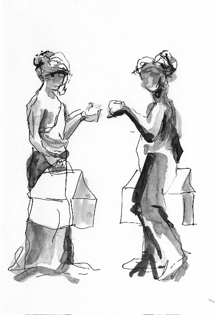
Fuck You Me Too, ink on paper, Catherine Haley Epstein
Tagged: Agnes Martin, black & white, Catherine Haley Epstein, studio practice
0 Comments
Would you like to share your thoughts?